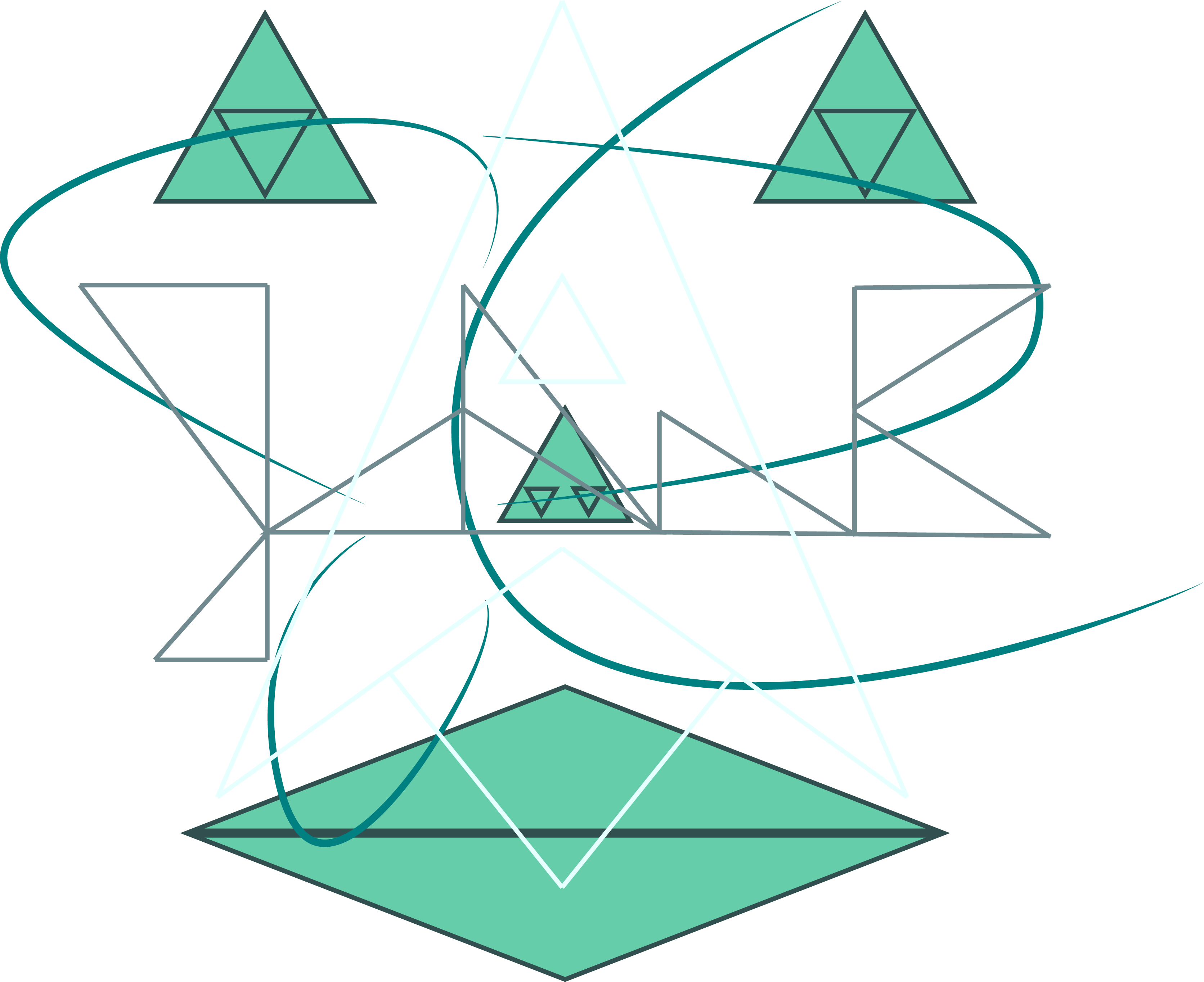
This is the final product of my self-portrait. I compiled several images together that were initially drawn individually to introduce chaos to my work. I initially thought of the idea as I was created the sketches on my tablet. I had run out of ideas with only nine sketches and needed one more. Staring at the screen long enough, the tablet eventually turned off, and I saw myself looking at the marks left behind from each drawing on the screen. Taking a picture of that, I made it my third sketch. So, while my self-portrait is composed of four drawings, it is actually composed of five of my sketches.
Each image, barring one, is composed solely of triangles, the shape I’ve had a preference for since Kindergarten. The color scheme was intentionally chosen based on my favorite color, RGB 0-128-128, otherwise known as Teal, and related colors. Those colors are meant to highlight specific drawings over others. The topmost layer, the near-white rocket ship, is meant to be almost hidden until the image is closely examined. The second layer, my name and the initial of my last name formed with triangles, is a green-grey to allow it to be easily seen but also easily ignored. The third image, the only one not made of triangles, is a drawing I made this past summer as a personal logo. This drawing, which, despite not being made with triangles, is the one I most closely associate with myself, so was therefore colored perfect teal. Finally, the face made from triangles is the bottom layer, which is easily seen because it is filled in with both a light and outlined with a dark green.
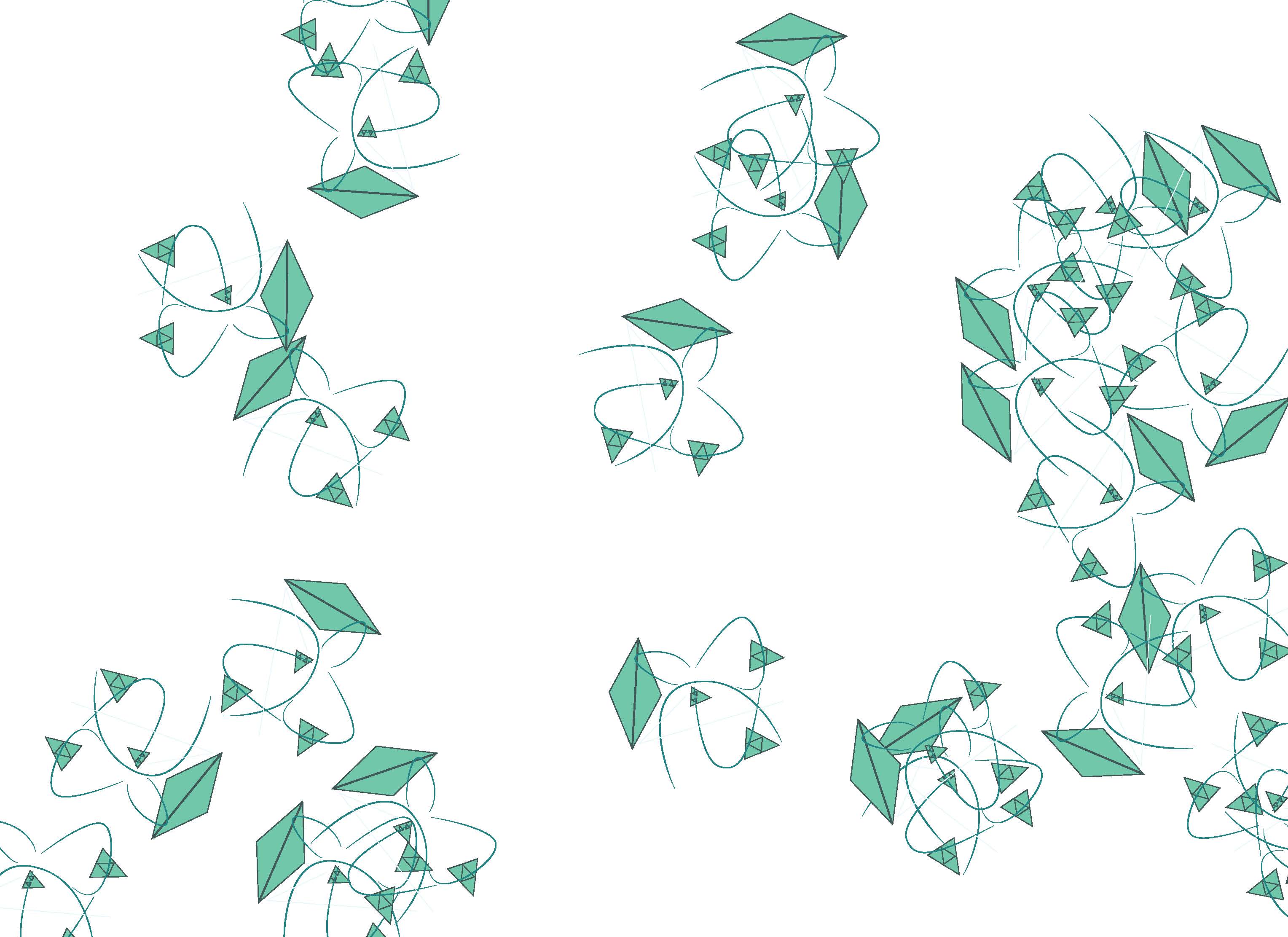
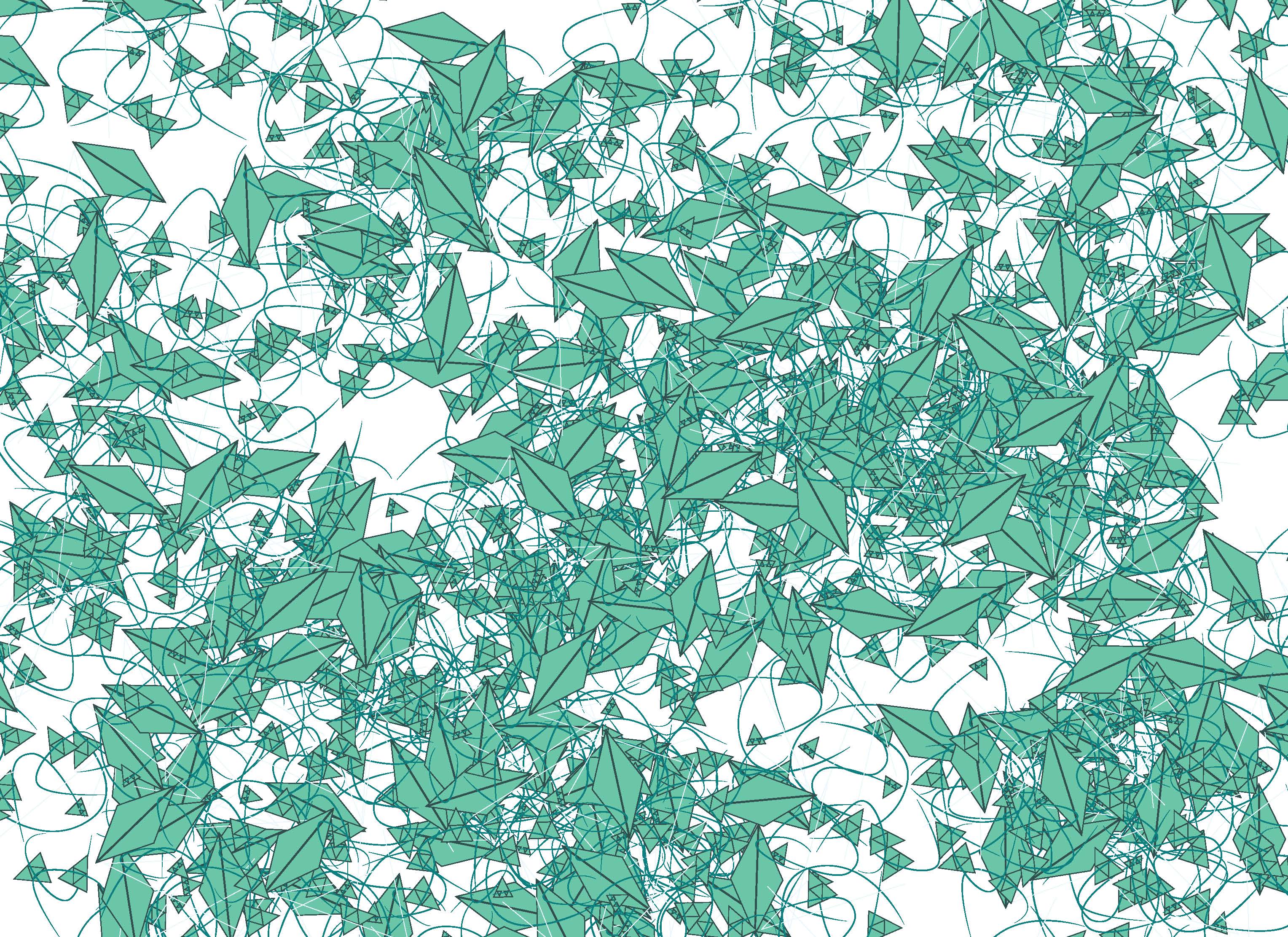
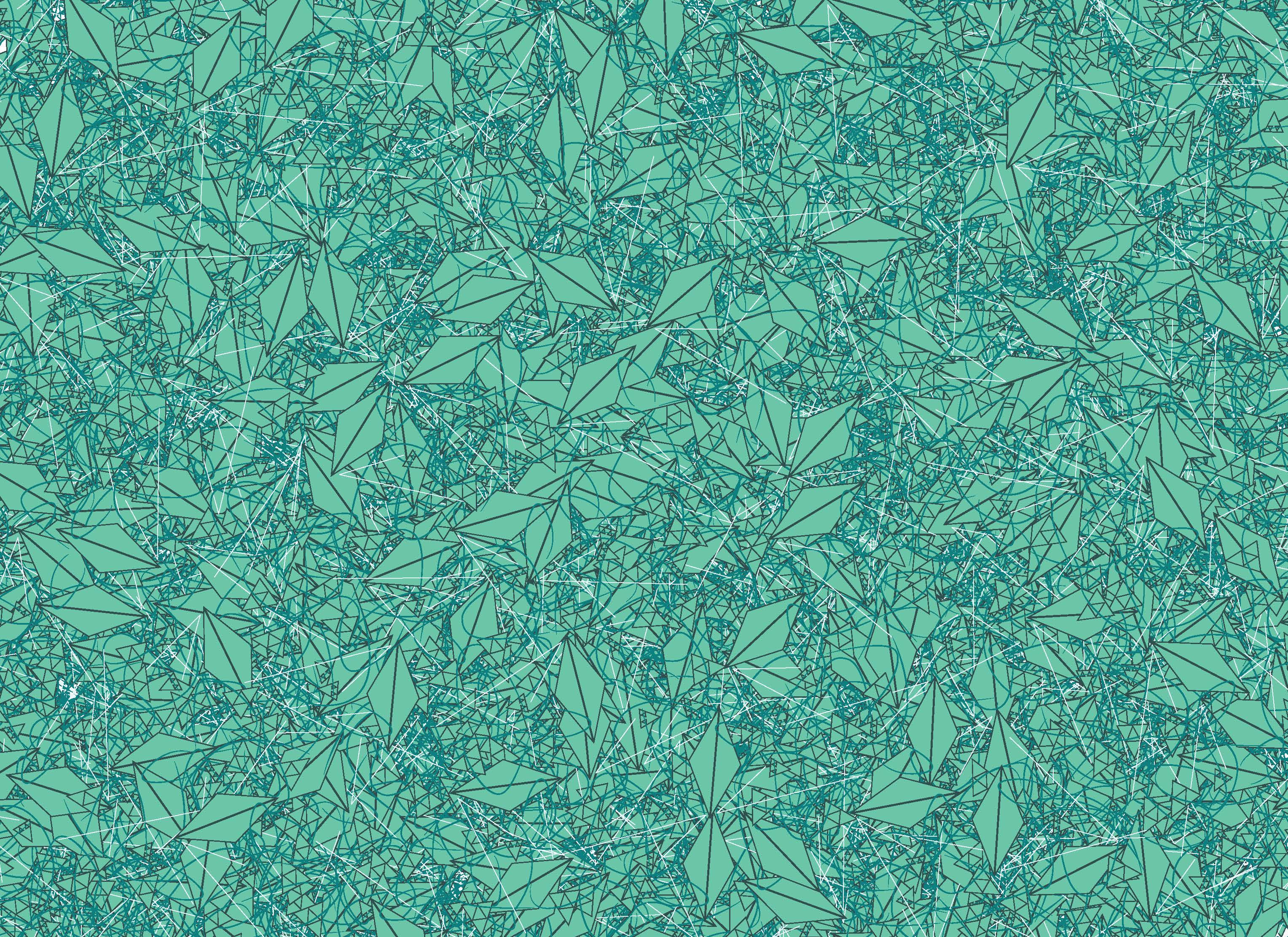
Self-Portrait as a Pattern
Unfortunately due to the apparent constraints of Processing, some of my self-portrait was not included. I am looking into a fix for this.
Drawing One
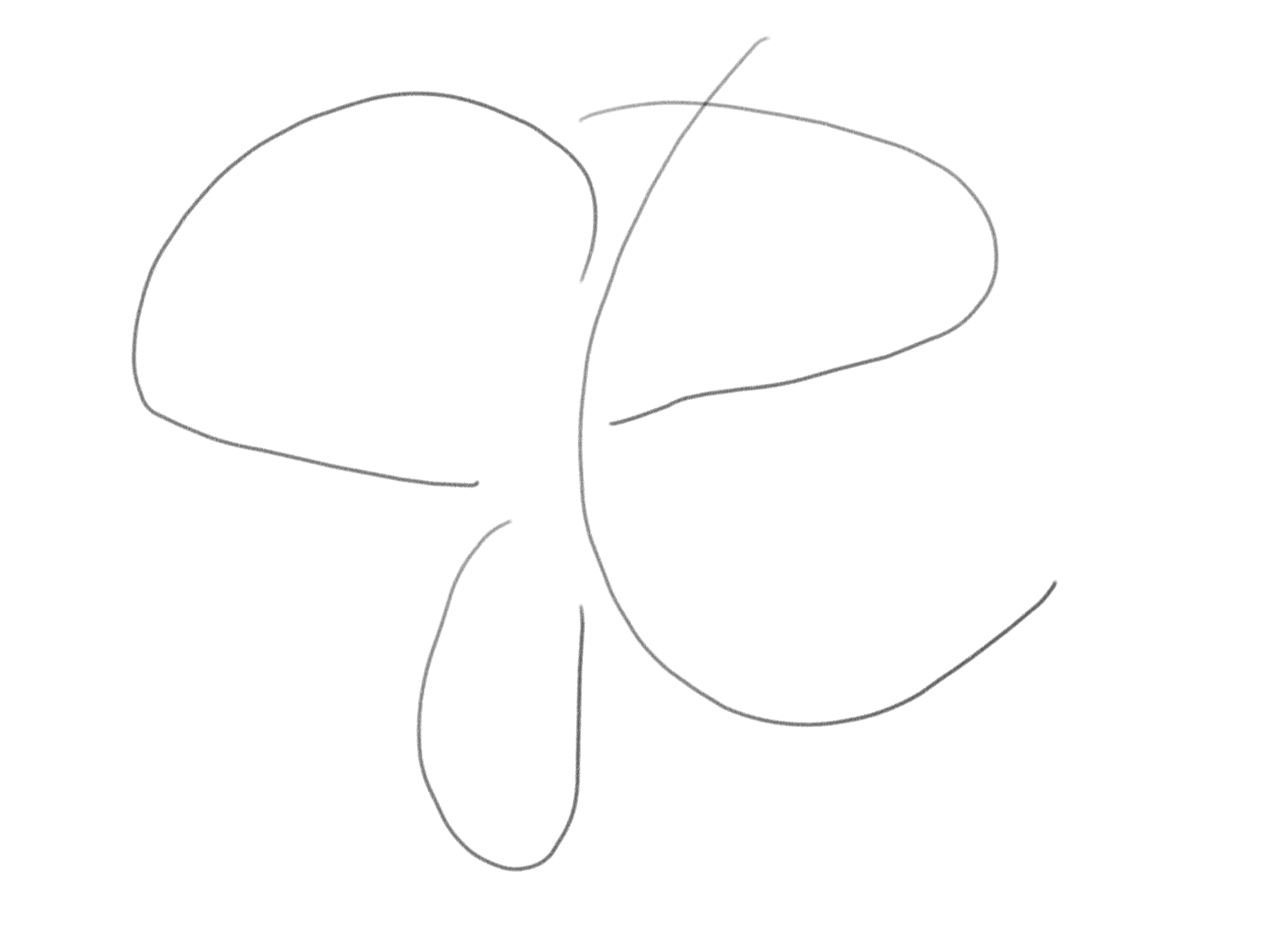
The image is the first sketch I made, which was then converted into a better proportioned image in Illustrator and colored RGB 0-128-128, Teal, my favorite color, on the right. There are many levels to this image, intentionally because it is originally the logo that I designed for myself (Stribely). It is created using my initials, a capital, cursive J (the two leftmost curves), a capital R (the two rightmost curves), and a capital C (the center curve, which also forms the R). In addition, the logo simultaneously embraces both my ambition and love of aviation by formed a minimalist airplane. The three curves that don’t form the C create the body of the plane and the curve of the C traces its path in the sky. I’ve always liked the phrase, “the sky’s the limit” as a representation of ambition (although as I note later with Drawing Four, I prefer a minor adaption to that more), which I think is a trait that is misunderstood because it’s often portrayed as being leading to immoral behavior. I want to embrace my ambition while also embracing other traits that keep morality in check.
Drawing Two
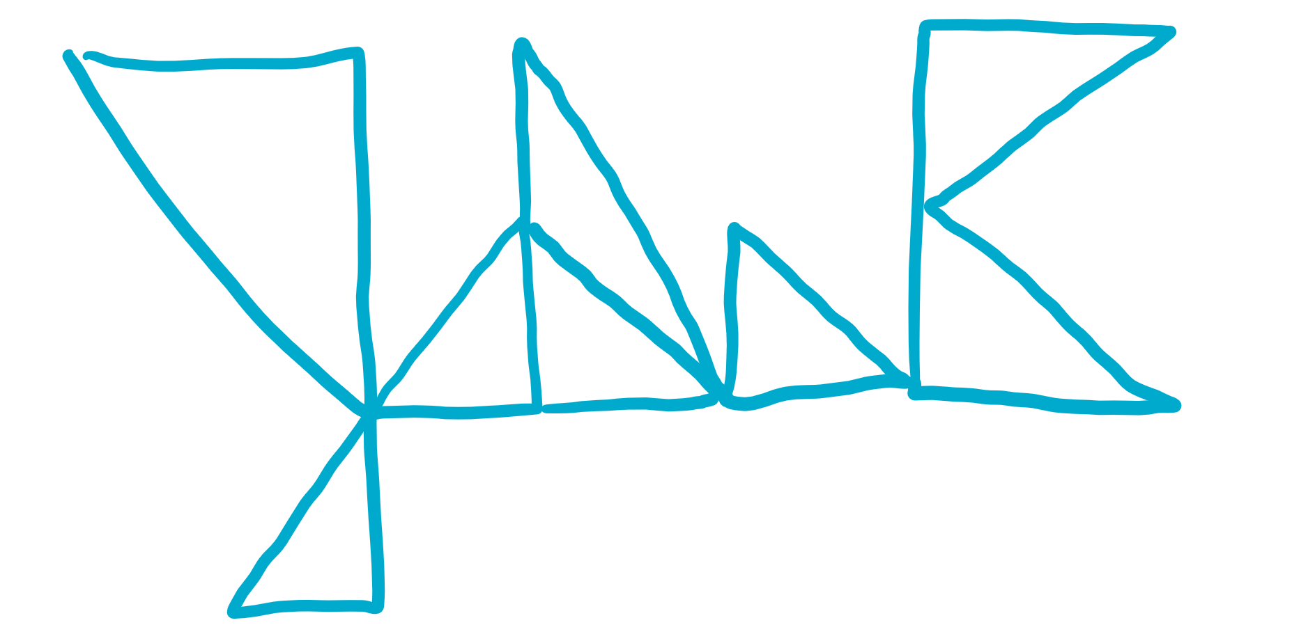
This image is the sixth sketch I drew, which was originally inspired by creating my first name out of triangles, then adapting it to look like it was cursive (this is most noticeable cursive aspect), then finally adding the C at the end. As mentioned before, I created it completely out of triangles because the triangle is my favorite shape.
Looking around, triangles are found everywhere. They are “the only two dimensional polygon that if constructed of rigid members with hinged corners is absolutely fixed in shape up to the compressive and tensile limits of its members” (Fuchs). In fact, triangles are strong enough that they are found in unexpected places of architecture. Thinking of Spaceship Earth in Epcot brings to mind a circle, not a triangle. But, if properly examined, it is clear that the sphere is actually made up of pyramids that are made up of triangles, forming a geodesic sphere (O’bryant). This is an interesting connection to me, because my mom’s cousin was actually one of the designers of that building.
Essentially, the triangle is the strongest and most interesting basic shape. I find that to be beautiful. I’ve colored this drawing grey because, while it is obviously a good abstract representation of myself, it is not the most interesting of the drawings, so I wanted it to be easily visible but also easily ignored.
Drawing Three

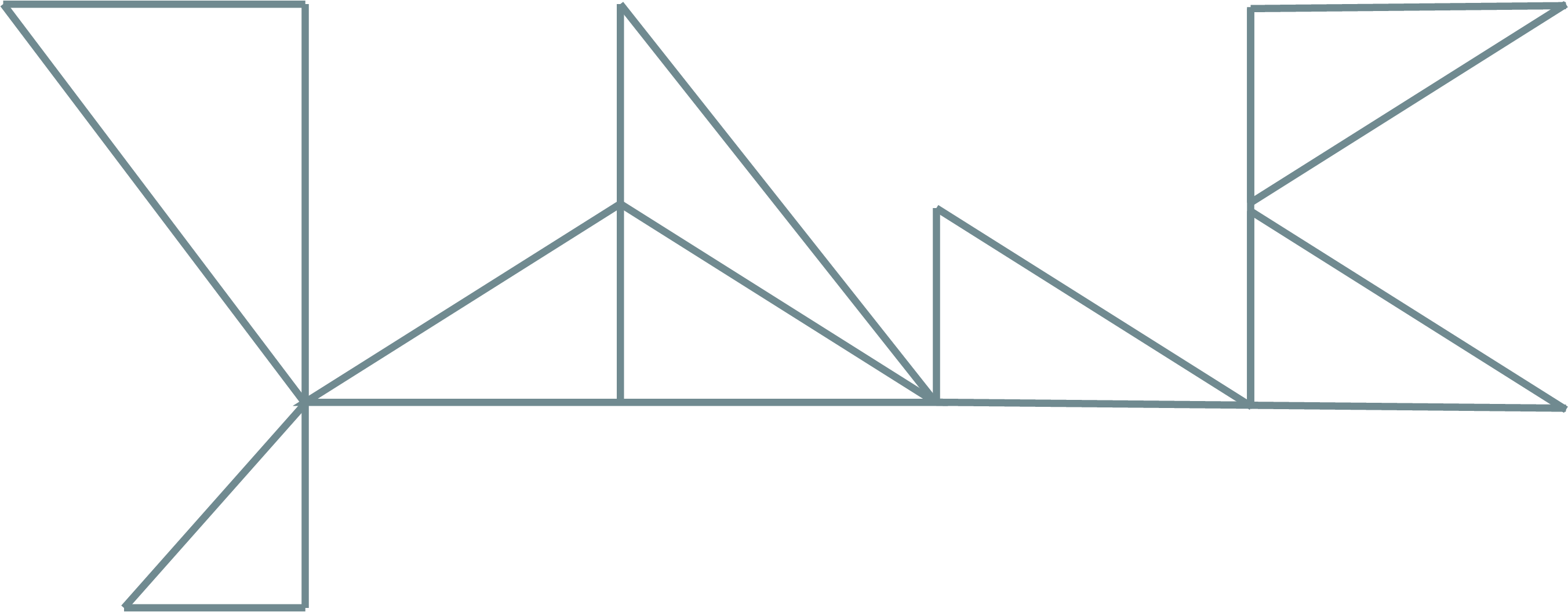
This drawing is perhaps my most simple and was also my seventh sketch. I stuck with the triangles, but wanted to create a minimalistic face. I kept the background transparent to further that aim. While this face may not look anything like me (no part of my face is a perfect triangle), I feel that in adding a face colored using adaptions of my preferred color it grounds the self-portrait more in reality, while keeping it abstract.
Drawing Four
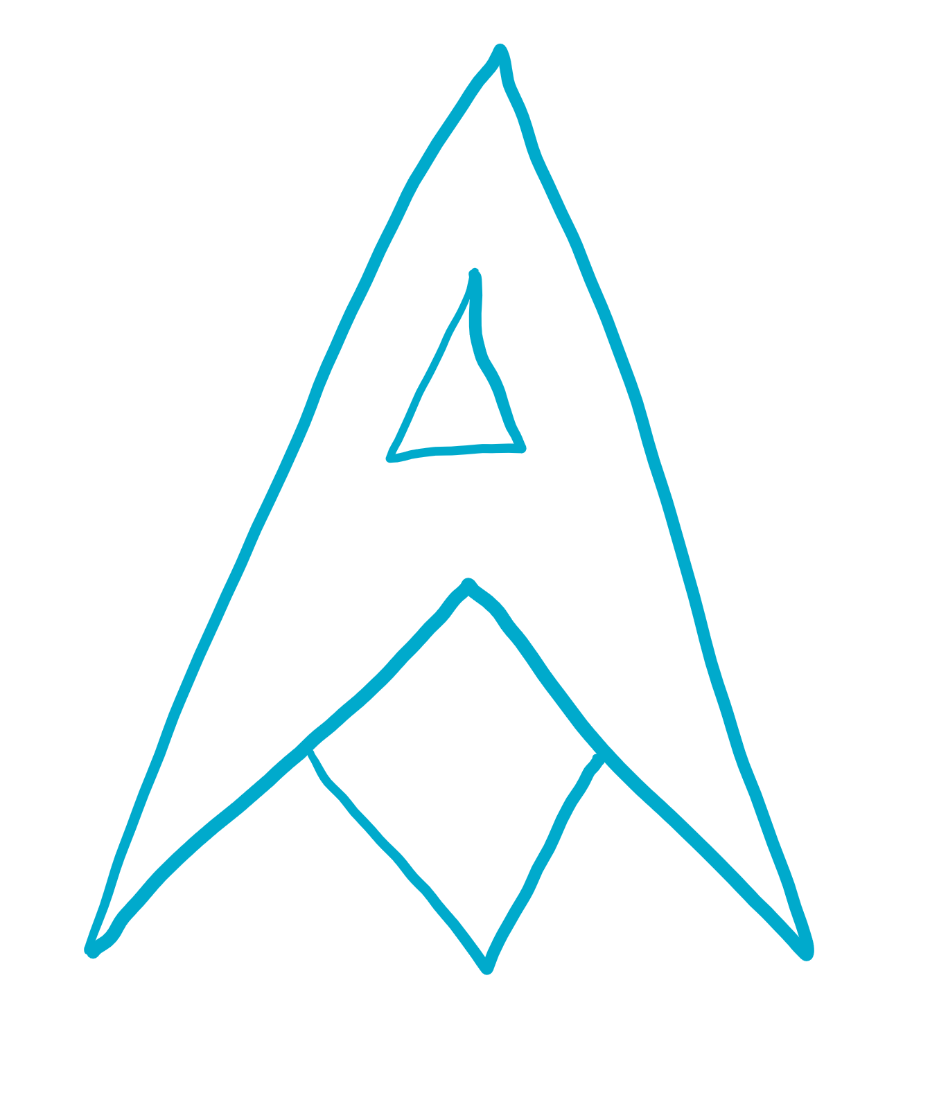
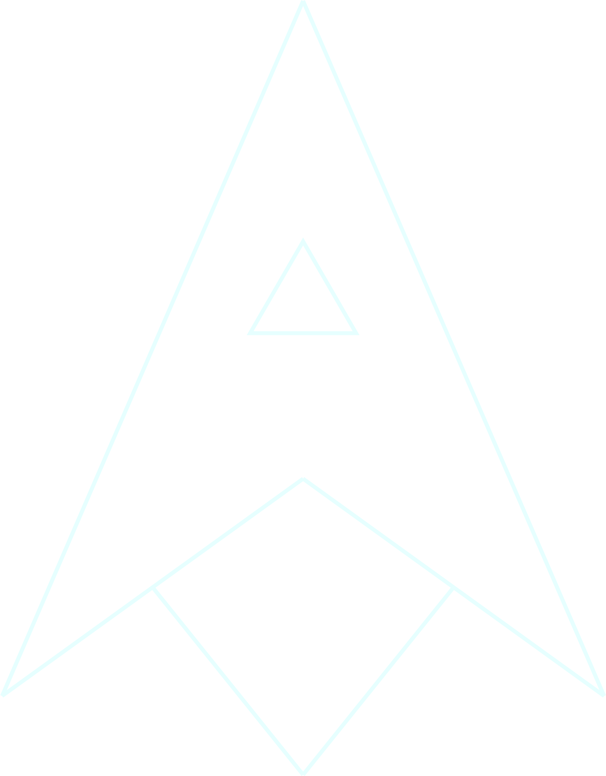

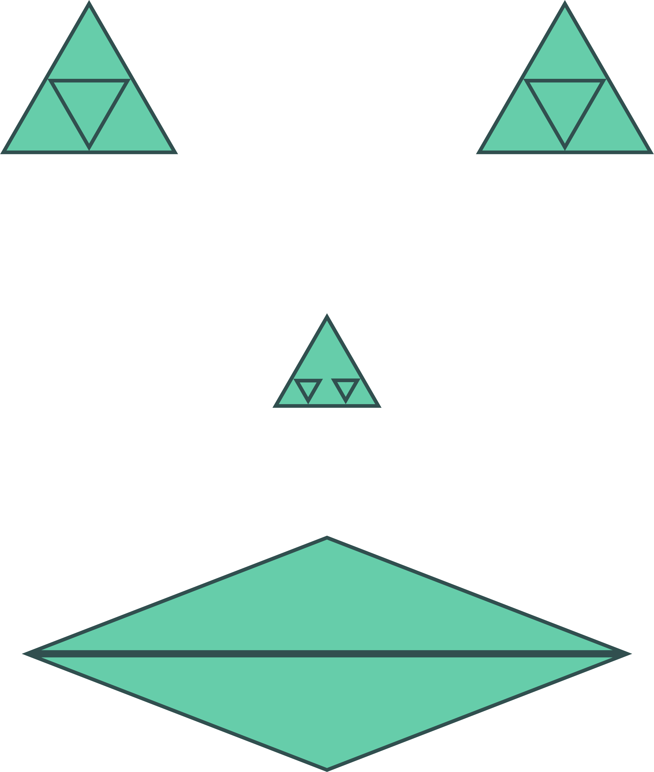
This final drawing was the ninth that I created. It was initially inspired by the Star Trek logo (the image to the left). Star Trek has been an incredibly influential part of my life, so in creating a self-portrait I wanted to somehow incorporate the Star Trek logo. In the book Federations, the logo is explained within the Star Trek universe as being a graph of the energy required of light-speed travel (Reeves-Stevens 137-139). I adapted this design slightly, making it out of two triangles, one cut out of the other, and replacing the star with another triangle, in order to make it my own. Realizing that what I had looked very similar to a rocket, I then added the final triangle on the bottom, implying space travel of some kind. This brings back the phrase “the sky’s the limit” with a minor adaption, making it “not even the sky’s the limit,” which I prefer over the original. It more accurately encapsulates my thoughts on ambition that I discussed with drawing one.
Annotated Bibliography
Fuchs, John. “The Strength and Mystery of Triangles.” CTG Technical Blog, 30 Nov. 2017, techblog.ctgclean.com/2012/10/the-strength-and-mystery-of-triangles/.
- Since Kindergarten I’ve known I love triangles. However, for this project I endeavored to discover why, as triangles are clearly very fundamental to my self-portrait. What I discovered is that I am intrigued by triangles’ unique strength, particularly as an architectural tool. It brought back memories of early grade school, when I was fascinated with building things. During recess or other free time I remember sitting with friends trying to build the tallest tower. Because of their strength, triangles are perhaps the most
Reeves-Stevens, Judith, and Garfield Reeves-Stevens. Federation. Pocket Books, 1994.
- While not the book that got me interested in Star Trek, as that was watching Star Trek: Original Series, Federation was the first book that took Star Trek beyond being just a science fiction show for me. It united the characters from The Original Series with those from The Next Generation in a unique and interesting way, and was a contributing factor towards me seeking out more Star Trek stories. It sits on my bookshelf today.
O’bryant, Mallory. “The Design and Construction of Epcot’s Spaceship Earth.”Malloryland, 13 Sept. 2011, malloryobryant.wordpress.com/2011/09/13/the-design-and-construction-of-epcot%E2%80%99s-spaceship-earth/.
- Anyone who knows me well knows that I would love to have been at a World’s Fair during their height. Epcot was originally designed with that vein in mind, except more entertaining. When I visited Disney World it was my favorite park, and later my mom told me that her cousin was actually one of the designers of its signature ride, Spaceship Earth. With that history, combined with its geodesic sphere uniting with my love of triangles, makes the park stand out in my mind even more than it already would have.
Stribely, Mary. “Personal Branding: How To Design Your Personal Brand Image In 10 Steps [Cheat Sheet] – Learn.” Canva, Canva, 26 June 2015, www.canva.com/learn/personal-branding/.
- With a name as common as John Crawford I have to be proactive with my personal brand. I own both johncrawford.net and johncrawford.us. This article has helped and is continuing to help me develop my personal brand. In particular for this project, it is where I got the inspiration to design my personal logo, which features directly in my self-portrait.
“Symbol-Clipart-Star-Trek-4.” PinArt, moziru.com/explore/Symbol%20clipart%20star%20trek/.
- In the book Federations, the logo is explained within the Star Trek universe as being a graph of the energy required of light-speed travel (Reeves-Stevens 137-139). The star represents the point at which a ship is traveling at the speed of light. The top curve is the energy required (reaching infinity) without warp drive, and the bottom curve is the energy required (avoiding infinity) with warp drive. However, being the logo of something this impactful on my life lends the image importance to me, with or without that fictional explanation.